Data-driven strategy powered by Silicon Valley analytics and creativity. Silicon Valley Social Value provides consulting to mission-driven organizations and philanthropists. Learn more about our clients and areas of expertise.

Brand Identity Kit

This webpage describes the basic guidelines we can follow to ensure consistency for the Silicon Valley Social Value brand in the real world—both online and offline. All of the necessary files for digital and print applications are labeled and linked for download right from this webpage.

Last Update: May 2018

TABLE OF CONTENTS

Click one of the links here to jump to that section below:

  1. The Logo
  2. The Color Scheme
  3. Typography
  4. Social Media

A NOTE ON USAGE

This site is designed to work best in Google Chrome. If you're using Safari or Internet Explorer and want to download logos, you'll have to right-click then select "Save image as...", otherwise just click the button!


1.1 Logo Arrangements

The logo allows for multiple arrangements. Note the proper arrangement and proportions of each configuration—kindly allow for breathing room and refrain from deviation.


Full Logo

The full logo is comprised of the business name and the parallelogram. Optionally, you can include the descriptor. Good use cases include: website, business cards, email newsletter, flyers, and pamphlets. 


Abbreviation

SVSV, the abbreviation of the full business name. This alternate logo is good for use in smaller spaces where we don't have enough room for the full logo to be legible. The abbreviation can be used with or without the business name beneath it. Good use cases include social media profile photos, as a sponsor logo on posters, and on other people's website (e.g. when speaking at a conference). 


Parallelogram

The parallelogram is unique, recognizable, and strong. In certain circumstances, the parallelogram can be used on it's own. The parallelogram should always be displayed in the primary brand color, electric salmon. Good use cases include places where the other brand information will be obvious with context: favicon of the website, slide decks, as a "watermark" on presentation materials, and anywhere that needs a little flair. 


1.2 Logo Color Inversions

In certain contexts, the logo may be used with inverted colors or in black and white. For example, the back of your business card has the full logo displayed with the inverted color palette (white logo on a black background). Another use could be the Abbreviation with inverted colors as a social media profile picture. Perhaps you’re sponsoring an event and they are printing materials with sponsor logos in black and white—now you’re equipped to handle that situation too.

These files are for use on a dark background, ideally our charcoal color listed below. 


Square Versions

1.3 Logo Best Practices

Abide by these simple guidelines to ensure your logo represents your brand effectively across all client-facing materials.

  1. Maintain the official color palette & arrangements.
  2. Maintain the logo proportions—don’t distort the image by stretching or squishing the aspect ratio.
  3. Maintain a proper exclusion zone—the logo is a strong visual mark, give it room to breathe.
  4. Make sure the logo is placed on a background with enough contrast. The standard logo should be used on a white background. The color inversions should be used on a dark background.
  5. Make sure to use the original logo with the proper typography instead of recreating it.
  6. Typically, one instance of your logo will suffice for most advertisements and client-facing materials.
 
SVSV Full + Tagline.png

2.0 Color Scheme

Along with the arrangement of the logo, the consistent color choices will help increase recognizability of your brand. An intentionally bold electric salmon functions as the primary color of the brand when viewed on dark backgrounds (with a darker shade for white backgrounds).

Backgrounds are typically done in charcoal (website, slide deck title slides, business cards) or white. A note on color usage: We emphasize "using less color to make it more colorful," a design principle which implements a primary color economically.

Official color codes are listed with each color.


Salmon

HEX#fa5a61
RGB250, 90, 97

Salmon Dark

HEX#EB5C54
RGB235, 92, 84

Charcoal

HEX#262c30
RGB38, 44, 48

White

HEX#ffffff
RGB255, 255, 255

3.0 Typography

Roboto

The Primary font is Roboto. 

Roboto is the primary font to use for headings, body text, slide presentations, and any larger block of text. The font was created by Google during their Material Design rebranding as the primary interface font (their response to Apple's San Francisco & an iteration on Helvetica). It is currently used on all of their UI design and devices.


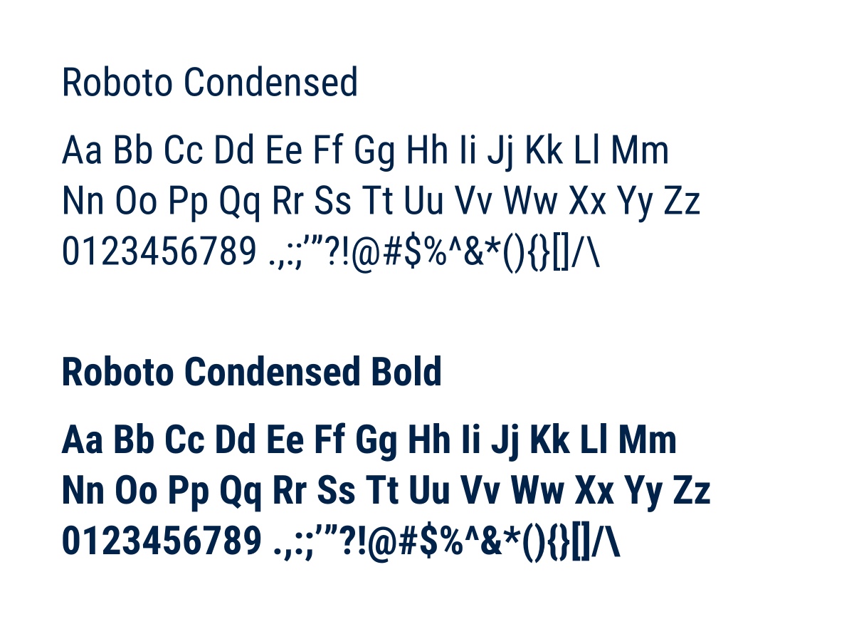
Roboto Condensed

the Secondary font is Roboto Condensed.

Used sparingly for H3 headings (the smallest ones) on the website, buttons, and navigation. This font is always used in ALL CAPS and is definitely more squat and "masculine" ...perhaps a little austere. Used sparingly, it adds a dash of seriousness and impact to the brand. Great for pithy captions, headings, or labels. 

4.0 Social Media

We believe simplicity on social media profiles works best.


FOR PROFILE IMAGES:

Most channels (Facebook, Twitter, Instagram) use square or circular profile images—for those sites the square versions here (or without the name) work perfectly. Trying to cram your entire logo into those small avatars usually results in an unreadable blur.


Facebook Social Share

This image is sized for the Facebook "Social Share" dimensions (what comes up when someone links to your website in a Facebook post).